News Flash: browngrotta arts and artists get good press

Posted in Magazines with tags , , , , , , , , on February 27, 2011 by arttextstyle


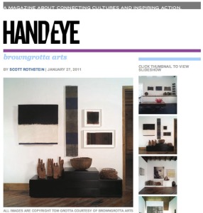
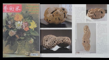
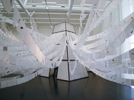
The last couple of months have seen browngrotta arts and the artists whose work we represent make the news in periodicals online and around the world.  Lia Cook’s work graced the cover of the December 2010 issue of Textil Forum, published in Germany, as part of a fascinating article by the artist, “An investigation: Woven Faces and Neuroscience” http://www.exacteditions.com/exact/browse/573/911/7936/2/44?dps=on (more on that project in an upcoming post). The January issue of the always striking online magazine Hand/Eye included a piece on our singular business/life model, “Living with Art,” by artist and writer Scott Rothstein http://handeyemagazine.com/content/browngrotta-arts. The related slideshow features dozen of art works on display in our barn/gallery/home. (You can read more by Scott Rothstein on his blog, http://artfoundout.blogspot.com, in American Craft magazine and elsewhere.) Meanwhile, the January/February of the UK Crafts magazine includes images from Lizzie Farey’s solo exhibition at City Art Centre, Edinburgh, Scotland http://www.craftscouncil.org.uk/crafts-magazine/latest-issueThe January issue of Artist Magazine from Taiwan has a several-page article about Norie Hatakeyama by Ming-Whe Liou, with photos by Tom Grotta. We can’t tell you what it says — but it looks good. http://www.artist-magazine.com/magazine/index.php.
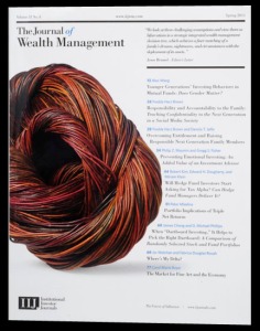
Last, but certainly not least,
the cover of the Spring 2011 issue
of The Journal of Wealth Management,
features Tom Grotta’s photo of
Christine Joy’s willow sculpture, Bundle
http://www.iijournals.com/toc/jwm/13/4.


Dispatches: Plymouth City Museum and Art Gallery, Plymouth, UK

Posted in Commissions, enamel, stone with tags , , on February 20, 2011 by arttextstyle

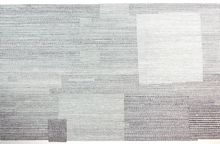
Calculus, by Sue Lawty, 2m x 3m, natural stone on gesso. photo by John Coombes


Taking Time: Craft and the Slow Revolution, opens February 12th at the Plymouth City Museum and Art Gallery and runs through April 9, 2011.  The exhibition, which was curated by artist Helen Carnac for Craftspace, “considers how the practice of contemporary craft making embraces similar values and philosophies to those supported by the Slow Movement.  Both think through where things are made, by whom and the importance of provenance. They ask us to slow down, perhaps not literally but certainly philosophically, and to reflect on other and perhaps more thoughtful ways of doing things.”  Taking Time features 19 international artists, makers and designers, including Sue Lawty, Matthew Harris, Heidrun Schimmel and Sonya Clark, whose making practice and work connects with these ideas. In different and sometimes overlapping ways they examine the world through making and in places quietly ask questions about global and local conditions that we find ourselves in today. The exhibition aims to show that contemporary craft practice and its methodologies can generate a modern and timely response to current social debates.

Sue Lawty provided in-progress images and described the process of making of Calculus, her work large and meticulously crafted work for the Taking Time exhibition on her V&A blog  http://www.vam.ac.uk/vastatic/microsites/1395_lawty/wordpress last January. In making the work, she wrote, “hundreds and thousands of decisions were wrestled and questioned in researching, collecting, sorting, selecting, organising, ordering, laying out, composing… The process is by its nature, a meditative and slow affair. I found myself considering how each tiny found fragment of rock laid out in each single row, echoed the minute subtle nuances and individualities embedded in all the rows of all the fragments of woven cloth I’d encountered in the V&A stores. Each unique mark and decision of infinitesimal difference subscribing to the language of the whole.”

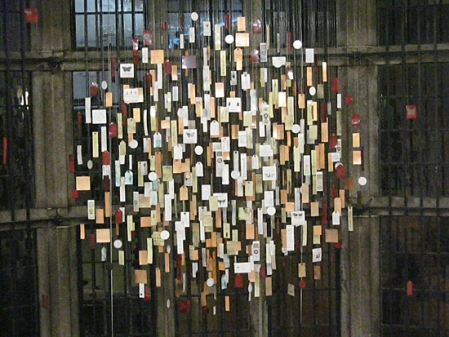
The Plymouth City Museum and Art Gallery was home to another fascinating installation, Labelled, by Dail Behennah, from February 2009 to May 2010  http://www.plymouth.gov.uk/lookingin_lookingout.pdf.

Labelled-by-Dail-Behennah

Labelled was made of 490 suspended enamel labels, hung in three layers forming a circle over 2m wide. Each enamel was printed with a label from natural history specimens within the Museum’s collections. These specimens were collected and intended for study. The labels were written by curators and collectors over the centuries and record various details about the specimens. One of the core aims of Labelled was to provoke viewers into thinking about why we collect and what can be learned from these specimens. The collections have a genuine scientific importance and are studied to help understand species and habitats in the past as well as in the present. The glittering enamels Behennah used reflected the preciousness of the natural world and different species. The circle was punctuated by red labels, which indicated an endangered or extinct species and reminded viewers of the fragility of the natural world.

Behennah says she was always interested in the idea of the collector’s cabinet which aimed to collect and preserve knowledge. “Without natural history collections in museums, and their associated information, we would not know which species are threatened, on the verge of extinction or already extinct,” says Behennah. “Some, such as the dodo and passenger pigeon, may live on in folklore, but species of insignificant-looking insects or fish can disappear without trace if they have not already been recorded, classified and labelled by collectors in the past, and preserved in museums today.” It was Behennah’s hope that the installation would engender debate about museums and their role, as well as debates surrounding species diversity and conservation. “These are important topics,” Behennah notes, “especially now that we are appearing to witness climate change and habitat movement and reduction.” The Museum’s website still includes additional information, including and interview with Behennah, images of the installation process and some of the specimens and more. http://www.plymouth.gov.uk/lookingin_lookingout.pdf

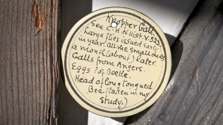
An example of an enamel label, of the sort Dail Behennah prepared for her installation work, Labelled. A large part of the value of a museum is contained in its labelling and scholarship, a fact that is generally not acknowledged. Each of the 490 enamels in Labelled is printed with a label from natural history specimens within the Plymouth City Museum’s collections.

The Plymouth City Museum and Art Gallery is at Drake Circus, Plymouth, PL4 8AJ.

Who Said What

Posted in Uncategorized with tags on February 13, 2011 by arttextstyle
Looking for inspiration?  Apparently, it doesn’t hurt to ask.
I’d asked around 10 or 15 people for suggestions… Finally one lady friend asked the right question, ‘Well, what do you love most?’ That’s how I started painting money.”  Andy Warhol

Some rights reserved by l r


Art into Type: Books We Talked Up in 2010

Posted in Books with tags , , , , , , , , , , on February 6, 2011 by arttextstyle

Last year saw several books published that we recommended to clients and purchased for family and friends.  Among these were Handcrafted Modern: At Home with Mid-century Designers by Leslie Williamson, a collection of photographs of beautiful, iconic, and undiscovered mid-century interiors, including the homes of Russel Wright, George Nakashima, Harry Bertoia, Charles and Ray Eames, and Eva Zeisel, among others. Williamson’s photographs show these creative homes as they were lived in by their designers: Walter Gropius’ historic Bauhaus home in Massachusetts; Albert Frey’s floating modernist aerie on a Palm Springs rock outcropping; and Wharton Esherick’s completely handmade Pennsylvania house, from the organic hand-carved staircase to the iconic furniture.

Another favorite volume of ours was 3-D Typography. We added “text” to the title of this blog so that we could cover two things we are passionate about: art that involves text and interesting books.  3-D Typography, which includes work by Gyöngy Laky and dozens of other artists who have created lettering out of everything from shopping carts and toilet paper to toothpaste and pinched flesh, fits both criteria.  The book’s creation was serendipitous.  The authors, Jeanne Abbink and Emily CM Anderson looked at three-dimensional type in the course on a redesign of American Craft magazine in 2007. There’s a 3D Typography Book blog, too at: http://www.3dtypographybook.com.  If you enjoy the book as much as we have, check out the blog, including Bavarian pretzel alphabet.

Long overdue was the first comprehensive survey of modern craft in the United States, Makers: A History of American Studio Craft, by Janet Koplos and Bruce Metcalf.  Makers follows the development of studio craft–objects in fiber, clay, glass, wood, and metal–from its roots in 19th-century reform movements to the rich diversity of expression at the end of the 20th century. More than 400 illustrations — including two photographs by Tom — complement this chronological exploration of the American craft tradition. Keeping as their main focus the objects and the makers — including Lenore Tawney, Ed Rossbach, Kay Sekimachi, Katherine Westphal, François Grossen, Lia Cook, Warren Seelig, Arturo Sandoval, Gyöngy Laky, Dorothy Gill Barnes, Clare Zeisler, Anni Albers, Lillian Elliott, Helena Hernmarck, Norma Minkowitz and Trude Guermonprez — the authors offer a detailed analysis of major works and discuss education, institutional support and the philosophical underpinnings of craft.

Another very special volume from 2010 is Written Weed, by Marian Bijlenga, published by Hein Elferink. This exquisite book includes 111 paste-ups / collages by the artist made of dried leaves, grasses and seeds. The images are like handwriting, Chinese characters, the letters of an alphabet. In order to emphasize the graphic quality of these works, the book is published in black/white. Only 400 copies were produced; each is numbered and signed. You can order it from browngrotta arts for $185.00

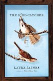
Though it was written in 2009, I didn’t discover The Bird Catcher, by Laura Jacobs, until last year. I loved it and ordered copies for several friends.  It’s a tender story of grief and healing in the big city.  But it was the detailed description of the protagonist’s window displays for a high-end department store and the evolution of her closest friend’s craft gallery — including a display of elegantly crafted goblets — that I most appreciated.

Dispatches: Helena Hernmarck's Tabula Rasa at Purdue

Posted in Art, Commission, Helena Hernmarck, Installations with tags , , , , on January 19, 2011 by arttextstyle

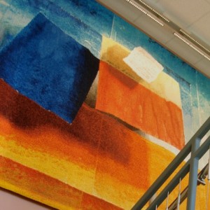
Helena Hernmarck's Tabula Rasa at the Yue-Kong Pao Hall of Visual and Performing Arts at Purdue's College of Liberal Arts

In 2009, Purdue University in West Lafayette, Indiana selected Helena Hernmarck to design and execute a tapestry for the Yue-Kong Pao Hall of Visual and Performing Arts at Purdue’s College of Liberal Arts. Lisa Lee Peterson, Professor and Graduate Director of Department of Art and Design, was instrumental in Hernmarck’s selection by the university art committee.  “Of the artists working in tapestry today,” the University’s press materials quote Jack Lenor Larson, “Helena Hernmarck stands without peer.  Her works have been selected for scores of prestigious public spaces and are seen each year by millions of viewers.  The hallmark of Ms. Hernmarck’s work is her skill in creating the optical illusion of three-dimensional designs on flat but richly textured surfaces of tapestry.”

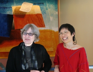
Helena Hernmarck and Lisa Lee Peterson in Front of Tabula Rasa at Purdue University. Photo by Skif Peterson

The University determined the location of the piece — the stairwell between the first and second floors — but left the other details to Hernmarck, who addressed two needs in her conception for the piece. She wanted the designed image to collectively represent the various art forms that are studied within the building — painting, ceramic, jewelry, textile, industrial design, theater, dance and music and she wanted the design to fit within the chosen area and increase the feeling of space in the stairwell.

Designed during the summer 2009, Hernmarck settled on a theme for the design: tabula rasa, the unwritten page, also a piece of ceramic that is scraped clean of marks after each use. Hernmarck’s Tabula Rasa would represent the beginning of the creative journey, whether at inception or at the commencement of an additional phase of the creative process.  During sketching, Hernmarck often finds the road to a final design through a process of changes or “scraping away” of initial ideas in such a way that previous marks still become part of the overall design. The early phase of Tabula Rasa is referenced in the few words written on a white page woven in the tapestry.

Hernmarck achieved the feeling of space for the stairwell that she envisioned by painting and then photographing small cut-up pieces of watercolors so that they cast shadows creating an image of being in flight. This enabled her to place the smallest of the elements of Tabula Rasa closest to the plane of the image, i.e. the place with the most sense of urgency. The final design includes a play on shadows to create a visual illusion on different levels which solved the challenge of designing the lower portion of the work to catch the eye of a person walking up the staircase.

Tabula Rasa, just off-the-loom on display at the Dalamas Museum, Falun, Sweden

Alice Lund Textiles, Borlange, Sweden produced the tapestry. The main weavers were Britt-Marie Bertilsson and Ebba Bergstrom. Tabula Rasa is the twenty-first tapestry of Helena Hernmarck’s design and technique to be woven at Alice Lund Textiles since 1975. The weaving took 30 weeks from beginning to finish. During this time, Hernmarck visited the studio periodically in order to oversee the quality of the work and to participate in both the weaving and the dying process of the wool with its numerous variations, shades and values. The colors were custom dyed at Wålstedts Textile Spinning and Dying Workshop in Dala-Floda. For Tabula Rasa the workshop dyed 24 kg of wool in 41 different colors. Hernmarck prefers to use of a variety of different qualities in the spun wool, such as thin gobeline, gobelin with rya wool, and single-ply rya wool. The final work includes hundreds of different colors and textures. A video of the weaving of  Tabula Rasa can be viewed at http://browngrotta.com/Pages/hernmarck.php.

Tabula Rasa by Helena Hernmarck Detail

Hernmarck’s unique technique combines different weaving methods and patterns with which she has experimented for more than 45 years. The Hernmarck tapestry technique creates a coarse texture much like the Impressionists’ painting style of the early 1900s. A full-scale enlargement of the image in black and white is created before beginning the tapestry. The cartoon is then adhered to the back side of the tapestry and draped over an aluminum tube that presses the cartoon up against the warp from underneath. The cartoon makes it possible to follow the forms and shadows that can be seen through the warp threads. In order to observe what the weaving will look like at a distance, the artist looks through a small pair of binoculars, turned backwards.  While the tapestry is woven on the horizontal loom, only 50 cm of the tapestry can be viewed at one time.  The ongoing action and reaction in changing colors and weaving techniques creates the overall beauty of the tapestry.

Tabula Rasa was unveiled at Purdue on October 12, 2010. The final size of the tapestry is 3 meters high x 4.45 meters wide (11′ x 14.3′); the weight about 50 kg. Hernmarck has created a related companion piece, Tabula Rasa 2, which is available for sale. http://browngrotta.com/Pages/newthisweek.php

Dispatches: Helena Hernmarck’s Tabula Rasa at Purdue

Posted in Art, Commission, Helena Hernmarck, Installations with tags , , , , on January 19, 2011 by arttextstyle

Helena Hernmarck's Tabula Rasa at the Yue-Kong Pao Hall of Visual and Performing Arts at Purdue's College of Liberal Arts

In 2009, Purdue University in West Lafayette, Indiana selected Helena Hernmarck to design and execute a tapestry for the Yue-Kong Pao Hall of Visual and Performing Arts at Purdue’s College of Liberal Arts. Lisa Lee Peterson, Professor and Graduate Director of Department of Art and Design, was instrumental in Hernmarck’s selection by the university art committee.  “Of the artists working in tapestry today,” the University’s press materials quote Jack Lenor Larson, “Helena Hernmarck stands without peer.  Her works have been selected for scores of prestigious public spaces and are seen each year by millions of viewers.  The hallmark of Ms. Hernmarck’s work is her skill in creating the optical illusion of three-dimensional designs on flat but richly textured surfaces of tapestry.”

Helena Hernmarck and Lisa Lee Peterson in Front of Tabula Rasa at Purdue University. Photo by Skif Peterson

The University determined the location of the piece — the stairwell between the first and second floors — but left the other details to Hernmarck, who addressed two needs in her conception for the piece. She wanted the designed image to collectively represent the various art forms that are studied within the building — painting, ceramic, jewelry, textile, industrial design, theater, dance and music and she wanted the design to fit within the chosen area and increase the feeling of space in the stairwell.

Designed during the summer 2009, Hernmarck settled on a theme for the design: tabula rasa, the unwritten page, also a piece of ceramic that is scraped clean of marks after each use. Hernmarck’s Tabula Rasa would represent the beginning of the creative journey, whether at inception or at the commencement of an additional phase of the creative process.  During sketching, Hernmarck often finds the road to a final design through a process of changes or “scraping away” of initial ideas in such a way that previous marks still become part of the overall design. The early phase of Tabula Rasa is referenced in the few words written on a white page woven in the tapestry.

Hernmarck achieved the feeling of space for the stairwell that she envisioned by painting and then photographing small cut-up pieces of watercolors so that they cast shadows creating an image of being in flight. This enabled her to place the smallest of the elements of Tabula Rasa closest to the plane of the image, i.e. the place with the most sense of urgency. The final design includes a play on shadows to create a visual illusion on different levels which solved the challenge of designing the lower portion of the work to catch the eye of a person walking up the staircase.

Tabula Rasa, just off-the-loom on display at the Dalamas Museum, Falun, Sweden

Alice Lund Textiles, Borlange, Sweden produced the tapestry. The main weavers were Britt-Marie Bertilsson and Ebba Bergstrom. Tabula Rasa is the twenty-first tapestry of Helena Hernmarck’s design and technique to be woven at Alice Lund Textiles since 1975. The weaving took 30 weeks from beginning to finish. During this time, Hernmarck visited the studio periodically in order to oversee the quality of the work and to participate in both the weaving and the dying process of the wool with its numerous variations, shades and values. The colors were custom dyed at Wålstedts Textile Spinning and Dying Workshop in Dala-Floda. For Tabula Rasa the workshop dyed 24 kg of wool in 41 different colors. Hernmarck prefers to use of a variety of different qualities in the spun wool, such as thin gobeline, gobelin with rya wool, and single-ply rya wool. The final work includes hundreds of different colors and textures. A video of the weaving of  Tabula Rasa can be viewed at http://browngrotta.com/Pages/hernmarck.php.

Tabula Rasa by Helena Hernmarck Detail

Hernmarck’s unique technique combines different weaving methods and patterns with which she has experimented for more than 45 years. The Hernmarck tapestry technique creates a coarse texture much like the Impressionists’ painting style of the early 1900s. A full-scale enlargement of the image in black and white is created before beginning the tapestry. The cartoon is then adhered to the back side of the tapestry and draped over an aluminum tube that presses the cartoon up against the warp from underneath. The cartoon makes it possible to follow the forms and shadows that can be seen through the warp threads. In order to observe what the weaving will look like at a distance, the artist looks through a small pair of binoculars, turned backwards.  While the tapestry is woven on the horizontal loom, only 50 cm of the tapestry can be viewed at one time.  The ongoing action and reaction in changing colors and weaving techniques creates the overall beauty of the tapestry.

Tabula Rasa was unveiled at Purdue on October 12, 2010. The final size of the tapestry is 3 meters high x 4.45 meters wide (11′ x 14.3′); the weight about 50 kg. Hernmarck has created a related companion piece, Tabula Rasa 2, which is available for sale. http://browngrotta.com/Pages/newthisweek.php

Exhibition News: All About Anni

Posted in Art, Exhibitions, galleries with tags , , , , , on January 12, 2011 by arttextstyle


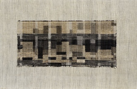
Anni Albers. City, 1949. Pictorial weaving. 44.5 x 67.3 cm. ©2011 The Josef and Anni Albers Foundation/Artists Rights Society New York

You’ve got just under a month to see Inspired by: The legacy of Anni Albers and Anni Albers: Design Pioneer at the Ruthin Craft Centre in Wales, which close on February 6, 2011.

Fiona Mathison, Sanctums, 2004 (photo courtesy of the artist)

Believing that aesthetics should be a consideration in every aspect of daily life, Anni Albers joined the Bauhaus as a student in 1922. Though she was initially interested in painting, Albers and other female students were encouraged to join the Weaving Workshop, which included a class taught by Paul Klee.  One of the foremost textile artists of the 20th century, Albers experimented with new materials and elevated textiles to an art form. Her work has had an influence on generations of designers and craftspeople, including the six contemporary UK artists/designers whose work is featured in Inspired by: the legacy of Anni Albers.

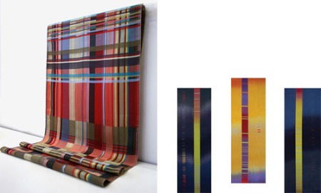
Wallace Sewell, Silk sampler fabric, designed by hand, woven by machine, 2010 (photo courtesy of the artists)Ptolemy Mann, Three Pieces to Dress a Wall (After Albers), 2010 (photo by Ptolemy Mann)

The exhibition was curated by Gregory Parsons. As the title suggests, each of the artists included — Dörte Behn, Christopher Farr, Ptolemy Mann, Fiona Mathison, Laura Thomas and Wallace Sewell — has been impacted by Albers, whether by her technical knowledge or her approach to design. Laura Thomas says she was, “deeply honored”  to have been invited to participate in the exhibition since, Albers is such an icon in the world of textiles and “a major source of inspiration to me over the years.”

Anni Albers: Design Pioneer, in Gallery 2 was produced in conjunction with the Josef and Anni Albers Foundation in Bethany, Connecticut. Anni and her husband, Josef, were pioneers of Modernism.This is the first exhibition in the UK to show Anni Albers’ textiles and jewellery, as well as her works on paper. Focusing on inventive and innovative aspects of her work, the exhibition identifies the threads that connect her different ways of working. The Ruthin Centre is at Park Road, Ruthin, Denbighshire, Wales.  For more information call +44 (0)1824 704774 or visit: http://www.ruthincraftcentre.org.uk/08artists.html.

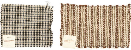
Left:Anni Albers. Sample for a textile. 3.8 x 9.2 cmRight:Anni Albers. Sample for a textile. 10.8 x 12.7 cmBoth images ©2011 The Josef and Anni Albers Foundation/Artists Rights Society New York

If you are not planning to visit Wales before he exhibitions close in February, you can order the accompanying catalog,  Anni Albers: Design Pioneer from thegallery@rccentre.org.uk for £8.99 GBP (plus shipping at cost). You can also see more examples of Anni Albers’ work in her gallery the Josef & Anni Albers Foundation website: http://www.albersfoundation.org/Albers.php?inc=Galleries&i=A_1. The website also features a chronology, bibliography and photos. Or better yet, you can bring Albers’ design sense home.  Rug designer Christopher Farr has brought two Albers designs into production for the first time. Available through Design Within Reach, they are crafted from hand-spun wool, which is then hand tufted in India. One was initially conceived as a silk-and-cotton wallhanging; the other is based on a 1959 runner design. http://www.dwr.com/product/designers/a-c/anni-albers/anni-albers-rug.do?sortby=ourPicks

JUST IN: Books Make Great Gifts 2010, Artist Recommendations V

Posted in Books with tags , on December 30, 2010 by arttextstyle

Our last 2010 artist recommendations — and these really are the last — present interesting examples of art intriguingly related to books.

Detail of Randy Walker's SAW PIECE NO.4 (AUTUMN)

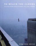
To Reach the Clouds: My High Wire Walk Between the Twin Towers, by Philippe PetitRandy Walker, who works regularly with threads and ropes and cables, writes, “Although it is a story involving only a single length of fiber, To Reach the Clouds: My High Wire Walk Between the Twin Towers, by Philippe Petit is one of the most inspiring, true stories I’ve ever read. Man on Wire was the movie about Petit, and it was fantastic too.”

Detail of MEGALITH IV by Simone Pheulpin

Darkness Moves: An Henri Michaux Anthology, 1927-1984

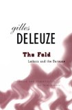
The Fold: Liebiniz and the Baroque

Two books that have inspired Simone Pheulpin’s works of folded cotton are The Fold: Liebiniz and the Baroque by G

illes Deleuze and Life in the Folds by Henri Michaux. The Fold was translated into English in 1992. An English excerpt of Life in the Folds appears in Darkness moves: an Henri Michaux anthology, 1927-1984 Simone also regularly refers to photography books on nature, desert, sea, archeology and fossil to inform her work.

Exhibit News: Lena McGrath Welker's Navigation [chime]

Posted in Uncategorized with tags , , , on December 27, 2010 by arttextstyle

Navigation series installation by Lena McGrath Welker photo by Ryen Welker

Lena McGrath Welker has spent the last six years creating the final works of the Navigation series, which currently fill the galleries of the North Dakota Museum of Art and which will remain on exhibit through January 9, 2011. The Navigation series addresses ways of thinking about the accumulation and transmission of knowledge and wisdom. What gives written language its power? In what ways does language fail us, and in what ways does it allow communication to take place?

Lena-Welker.Navigation-Cycle photo by Ryen Welker

In 2004, Welker showed four bodies of work from the series at the NDMOA. At that time, Museum Director Laurel Reuter invited the artist to return with the final installation in this, her major lifework. Twelve years in the making, the Navigation series concludes with the current installation, [chime]. The press release prepared by the Museum, describes Welker’s  process in considerable detail and is excerpted below.

Lena Mcgrath Welker Navigation Chimeimage installation by Ryen Welker

Moving through her studio during the last six years have been hundreds of pounds of alabaster waiting to be carved, recently cast porcelain scrolls, weavings perpetually rolling off two looms, fabric collages, huge pastel and silver leaf paintings, stacks of glass, and on and on. Since returning home in 2004, Welker has learned to carve alabaster, to add the making of soft-ground etchings to her repertoire of printmaking skills, and to master historical bookbinding techniques including traditional Coptic, longstitch, tackets, accordion methods. And always, her work is interwoven with drawing.The pace of her work, however, has been determined by her health. Since that first North Dakota show, Lena was diagnosed with a non-malignant brain tumor. In December of 2006, she was treated with a relatively new gamma-knife radiation procedure intended to buy time for the artist— five, ten, or even fifteen years. Yet there are days she cannot work, bound to her bed with fierce headaches. 

Lena McGrath Welker photo by Ryen Welker

Even while living with a brain tumor, she has continued to develop her craft skills. In the alcove of the upstairs gallery, the viewer will find [chart] with small stacks of incised glass tablets. They are accompanied by vitrines filled with hand-dyed, indigo folios embellished with drawings and stitched imagery of what appear to be arcane maps. Floating above them are huge drawings incorporating Ptolemy’s diagrams, star measurements, constellations, abstract counting marks, the geometry of navigation systems, signs and symbols from Greek mathematical texts and scanned images of deep-sky nebulae.The sixteen-foot high, steel skeleton for a dovecote anchors [flight] in the west gallery of the main floor, the inside of which is skinned with translucent paper. The dovecote is home to funerary urns, blackened bronze and copper begging bowls resting on a low slate wall, and 120 often-blank, bound books stacked on the floor. Accompanying the dovecote are some 3,000, nine-inch fabric squares, each having either a single feather attached, or stitching that conveys a sense of writing or counting. They hang from the ceiling beams on fine thread, like Tibetan prayer flags. The feathers represent ideas as the Greeks first conceived them. Repetition abounds throughout the exhibition echoing the repetition of the mantra in meditation, of reoccurring themes in a musical composition, of sewing and weaving and chanting, of waves rolling across a vast ocean. 

In the east gallery and hovering just above the floor is an empty organdy room made from bolts of cotton fabric donated by the Pennsylvania company Testfabrics. This centerpiece of the installation [stillness] is surrounded by eight, fifteen-foot, vertical, paper scrolls drawn with dry pigment and graphite. Beneath them are rows of alabaster cairns and small porcelain scrolls. Thirty prints embedded in handmade abaca paper comprise [affinis], hanging on steel frames in the space between the east and west galleries. Their images connect [flight] in the west to [stillness] in the east.Welker named the exhibition Navigation [chime] because “chime has poetic and musical derivation, but it also refers to a system in which all the parts are in harmony, showing a correspondence of proportion or relation.” The artist imagines her wordless books as “a continuation of ancient books still with us, so carefully and beautifully bound, with folios of handmade paper, their words so arcane and unintelligible to us now as to disappear from the page.”


Lena McGrath Welker – Navigation [chime]

In the exhibition, Welker deals with uncertainty in an abstract and liminal way. She invites people to move through silence. She suggests the accumulation of experience through the physical massing of repetitive objects and motifs, and, finally, emptying out, as colors fade into transparency and words disappear. The transitions from gallery to gallery are equally subtle and connected. Because she uses mostly translucent materials, people are able to experience the work privately, while being aware of the community of others.


Lena McGrath Welker Navigation [chime]

According to the artist, “Many of the materials are light enough to move with the ambient air currents, and with people walking by. People respond to this movement with a ‘bodily’ intelligence, instinctively becoming quiet and walking more slowly. As sunlight pours through the windows and warms the rooms, the scents of silk and indigo are released.”

The North Dakota Museum of Art is located at 261 Centennial Drive on the University of North Dakota campus in Grand Forks. For more info, contact: 701-777-4195 or http://www.ndmoa.com/Current Exhibition/currentexhibition.html. The Museum hours are weekdays from 9 am to 5 pm and weekends from 1 am to 5 pm.
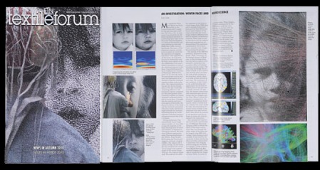

Exhibit News: Lena McGrath Welker’s Navigation [chime]

Posted in Uncategorized with tags , , , on December 27, 2010 by arttextstyle

Navigation series installation by Lena McGrath Welker photo by Ryen Welker

Lena McGrath Welker has spent the last six years creating the final works of the Navigation series, which currently fill the galleries of the North Dakota Museum of Art and which will remain on exhibit through January 9, 2011. The Navigation series addresses ways of thinking about the accumulation and transmission of knowledge and wisdom. What gives written language its power? In what ways does language fail us, and in what ways does it allow communication to take place?

Lena-Welker.Navigation-Cycle photo by Ryen Welker

In 2004, Welker showed four bodies of work from the series at the NDMOA. At that time, Museum Director Laurel Reuter invited the artist to return with the final installation in this, her major lifework. Twelve years in the making, the Navigation series concludes with the current installation, [chime]. The press release prepared by the Museum, describes Welker’s  process in considerable detail and is excerpted below.

Lena Mcgrath Welker Navigation Chimeimage installation by Ryen Welker

Moving through her studio during the last six years have been hundreds of pounds of alabaster waiting to be carved, recently cast porcelain scrolls, weavings perpetually rolling off two looms, fabric collages, huge pastel and silver leaf paintings, stacks of glass, and on and on. Since returning home in 2004, Welker has learned to carve alabaster, to add the making of soft-ground etchings to her repertoire of printmaking skills, and to master historical bookbinding techniques including traditional Coptic, longstitch, tackets, accordion methods. And always, her work is interwoven with drawing.The pace of her work, however, has been determined by her health. Since that first North Dakota show, Lena was diagnosed with a non-malignant brain tumor. In December of 2006, she was treated with a relatively new gamma-knife radiation procedure intended to buy time for the artist— five, ten, or even fifteen years. Yet there are days she cannot work, bound to her bed with fierce headaches. 

Lena McGrath Welker photo by Ryen Welker

Even while living with a brain tumor, she has continued to develop her craft skills. In the alcove of the upstairs gallery, the viewer will find [chart] with small stacks of incised glass tablets. They are accompanied by vitrines filled with hand-dyed, indigo folios embellished with drawings and stitched imagery of what appear to be arcane maps. Floating above them are huge drawings incorporating Ptolemy’s diagrams, star measurements, constellations, abstract counting marks, the geometry of navigation systems, signs and symbols from Greek mathematical texts and scanned images of deep-sky nebulae.The sixteen-foot high, steel skeleton for a dovecote anchors [flight] in the west gallery of the main floor, the inside of which is skinned with translucent paper. The dovecote is home to funerary urns, blackened bronze and copper begging bowls resting on a low slate wall, and 120 often-blank, bound books stacked on the floor. Accompanying the dovecote are some 3,000, nine-inch fabric squares, each having either a single feather attached, or stitching that conveys a sense of writing or counting. They hang from the ceiling beams on fine thread, like Tibetan prayer flags. The feathers represent ideas as the Greeks first conceived them. Repetition abounds throughout the exhibition echoing the repetition of the mantra in meditation, of reoccurring themes in a musical composition, of sewing and weaving and chanting, of waves rolling across a vast ocean. 

In the east gallery and hovering just above the floor is an empty organdy room made from bolts of cotton fabric donated by the Pennsylvania company Testfabrics. This centerpiece of the installation [stillness] is surrounded by eight, fifteen-foot, vertical, paper scrolls drawn with dry pigment and graphite. Beneath them are rows of alabaster cairns and small porcelain scrolls. Thirty prints embedded in handmade abaca paper comprise [affinis], hanging on steel frames in the space between the east and west galleries. Their images connect [flight] in the west to [stillness] in the east.Welker named the exhibition Navigation [chime] because “chime has poetic and musical derivation, but it also refers to a system in which all the parts are in harmony, showing a correspondence of proportion or relation.” The artist imagines her wordless books as “a continuation of ancient books still with us, so carefully and beautifully bound, with folios of handmade paper, their words so arcane and unintelligible to us now as to disappear from the page.”


Lena McGrath Welker – Navigation [chime]

In the exhibition, Welker deals with uncertainty in an abstract and liminal way. She invites people to move through silence. She suggests the accumulation of experience through the physical massing of repetitive objects and motifs, and, finally, emptying out, as colors fade into transparency and words disappear. The transitions from gallery to gallery are equally subtle and connected. Because she uses mostly translucent materials, people are able to experience the work privately, while being aware of the community of others.


Lena McGrath Welker Navigation [chime]

According to the artist, “Many of the materials are light enough to move with the ambient air currents, and with people walking by. People respond to this movement with a ‘bodily’ intelligence, instinctively becoming quiet and walking more slowly. As sunlight pours through the windows and warms the rooms, the scents of silk and indigo are released.”

The North Dakota Museum of Art is located at 261 Centennial Drive on the University of North Dakota campus in Grand Forks. For more info, contact: 701-777-4195 or http://www.ndmoa.com/Current Exhibition/currentexhibition.html. The Museum hours are weekdays from 9 am to 5 pm and weekends from 1 am to 5 pm.